Data Visualization for Pitch Decks: Which Chart to Use and When
Chart type selection guide for pitch presentations — which visual works for which metric, and what the data says about how investors actually read your slides.
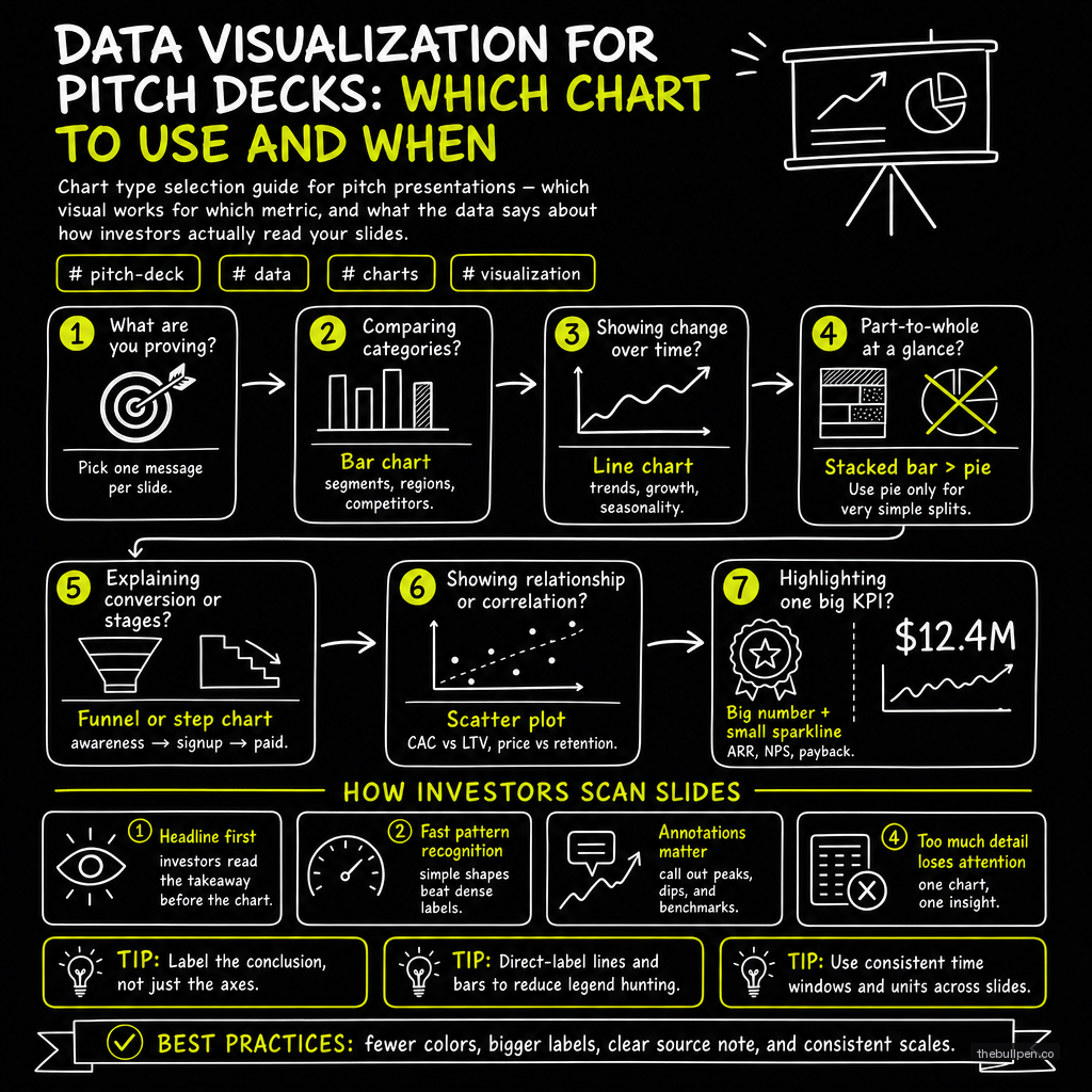
The DocSend study on investor attention spans should be required reading for every founder: partners spend an average of 2 minutes and 33 seconds on an entire pitch deck. Individual slides get between 5 and 10 seconds — less if the slide is dense, more if it's clean and the metric matters. That means every chart on every slide has to deliver its entire argument in the time it takes to read a tweet.
Most founders violate this constraint on the first data slide. They cram three charts onto one page, label axes in 8-point font, and assume investors will "take their time" with the numbers. They won't. The data slide is where a deck lives or dies, and the difference between a chart that persuades and one that confuses comes down to one question: which chart type does this metric deserve?
The Data-Ink Ratio and the One Chart Rule
Edward Tufte's concept of the data-ink ratio — the proportion of a graphic's ink devoted to actual data versus decoration — maps directly onto pitch decks. Every unnecessary gridline, every 3D bevel, every redundant label is ink that steals attention from the numbers you need investors to see. A pitch deck chart should aim for a data-ink ratio above 0.8: sparse axes, no fill patterns, no drop shadows, no gradients.
The logical extension of Tufte's rule for fundraising is the one chart per slide rule. A single, well-constructed chart with a clear upward or rightward trend is more persuasive than three competing visuals that force the investor to split attention and triage importance. If you have three compelling charts, you have three slides — or you have a prioritization problem in your narrative.
Related: Pitch Deck Mastery
Revenue Growth: The Line Chart
The line chart is the single most important visual in an early-stage pitch deck, and the bar for execution is high. The x-axis is time (months or quarters), the y-axis is revenue (or another growth metric like MRR or active users). The line should dominate the slide , thick stroke, high contrast, minimal distraction.
Airbnb's early pitch deck is the canonical example. Their revenue growth slide showed a simple black-and-white line chart with a single annotation: "Revenue grew 600% in 2009." No gridlines, no legend, no quarterly breakdowns to muddy the water. The line told the story; the annotation anchored the magnitude.
Best practices for the revenue growth line chart:
- Anchor the axes. Label the y-axis in plain units ($k or $M) and the x-axis in time intervals. Don't rely on context alone.
- Annotate the inflection point. If revenue doubled after a product launch, say so. A callout box with "2x after launch" is worth 20 seconds of explanation.
- No secondary y-axis. Ever. If you're tempted to overlay user growth on revenue on a second axis, you need two separate slides.
- Black and white or one accent color. Color should highlight one dimension , the line itself. Everything else stays gray.
Related: Pitch Deck Traction Slide for Seed
Market Size: The Horizontal Bar or Bubble
Market sizing slides are notorious for turning into data vomit. The three-number structure (TAM, SAM, SOM) works, but displaying it poorly undermines the credibility of the entire deck.
The horizontal bar chart is the safest choice. Buffer's seed deck used a simple three-bar layout , TAM, SAM, SOM , with the bars extending from left to right and the dollar figure placed at the end of each bar. The axis started at zero (non-negotiable for this chart type), and the bars were ordered largest to smallest so the eye could follow the funnel intuitively.
A bubble chart works when you need to introduce a second dimension , showing market size against growth rate or market maturity , but it introduces interpretive friction. A horizontal bar is faster for the investor to process. Given the 5-second window, choose the bar every time.
| Chart Type | Best For | Avoid When |
|---|---|---|
| Line chart | Revenue growth, MRR, user growth over time | Single timepoint comparisons |
| Horizontal bar | Market sizing (TAM/SAM/SOM), ranked categories | Showing trends over time |
| Vertical bar (column) | Unit economics (CAC vs LTV), period-over-period comparison | More than 8 categories |
| Cohort retention curve | Retention rates, churn, engagement stickiness | One-time snapshots |
| 2x2 matrix / scatter plot | Competitive positioning | Showing magnitude or volume |
| Table (minimal) | Gross margin, CAC, LTV, retention as a set | Large datasets or trends |
Related: Pitch Deck Templates That Raised Money
Unit Economics: The Bar Chart or Minimal Table
Unit economics slides answer one binary question for investors: does this business make money per customer? The visual needs to make that answer unambiguous in under five seconds.
The vertical bar chart comparing CAC (customer acquisition cost) against LTV (lifetime value) is the standard for good reason. Two bars, side by side , LTV taller than CAC. The ratio between them can be annotated directly above the bars. If the ratio is 3:1 or better, the slide closes itself.
Front's Series A deck took a different approach that worked well. Instead of a chart, they used a minimal table with four rows: gross margin, CAC, LTV, and retention. The key numbers were bolded, the units were consistent, and there was exactly enough data to prove the unit economics without overwhelming the slide. A table works here because the investor is scanning for four specific reference points , not trying to visualize a trend.
Whichever format you choose, follow these constraints:
- Never show blended CAC and paid CAC on the same slide. Pick one.
- Round to the nearest whole number unless the figure is below 100.
- Include the payback period in months , this is often the number investors linger on longest.
Related: Pitch Deck Traction Slide for Seed
Retention: The Cohort Retention Curve
A single-number retention figure ("90% retention!") is almost useless without context. Investors know that retention varies by cohort, by month, and by activation event. The cohort retention curve , a line chart where each line represents a cohort's retention over subsequent periods , is the gold standard.
Front's deck showed a retention curve that plateaued at approximately 90% after month three. The visual immediately answered the two questions an investor asks about retention: does retention stabilize? and where does it stabilize? The plateau at 90% told a stronger story than any headline number could have.
The curve should be rendered as thin, semi-transparent lines for individual cohorts, with a bold average line overlaid on top. Keep the x-axis to 12 periods maximum , showing 36 months of cohort data creates visual clutter that obscures the takeaway.
Related: Pitch Deck Mastery
Competitive Positioning: The 2x2 Matrix
The 2x2 matrix is the only chart type in a pitch deck that doesn't show quantitative data. Its job is to establish position . where the startup sits relative to incumbents on two axes that matter to the market.
Uber's early deck used a matrix with "Service Type" on one axis and "Price" on the other. Existing services clustered in the corners; Uber occupied the center-sweet-spot quadrant. The matrix worked because the axes were intuitive and the positioning was defensible.
Rules for the competitive matrix:
- Label both axes clearly. Investors should be able to read the axis labels and immediately understand why those two dimensions define the market.
- Place your company icon distinctively. Use a different shape, a fill color, or a callout circle. The investor should find your company before they find any competitor.
- Max 8 competitors. Beyond eight, the matrix becomes noise. Group fringe competitors under a single label if needed.
- No logos as data points. Use simple circles with company names. Logos vary in size and draw the eye unevenly.
Common Mistakes That Kill Data Slides
The most expensive error founders make on data slides is the truncated y-axis. Starting a revenue chart at $100k instead of $0 exaggerates the slope of growth. An investor who spots a truncated axis will question every other number in the deck. The axis must start at zero unless there is a threshold-based argument (e.g., "revenue above $1M ARR"), and that exception must be labeled explicitly.
Pie charts with five or more categories are the second most common mistake. Human vision is poor at comparing angular segments. A pie chart with seven slices forces the investor to scan the legend, match colors to categories, and estimate relative sizes , a mental operation that takes three to four times longer than the equivalent bar chart. If the data can be shown as a bar chart, show it as a bar chart.
Multiple charts per slide is the third mistake, and it's the one that hurts the most because it often reflects an abundance of good data. A slide with three charts forces the investor to choose which one matters. They will choose wrong, or they will choose none and move on. One chart per slide. If you have three strong data points, build three slides.
The 5-Second Test
Before any pitch deck goes into a data room, every chart should pass the 5-second test: show the slide to someone unfamiliar with the business for exactly five seconds, then hide it and ask for the single takeaway. If they can't reproduce the core argument . revenue is growing fast, retention locks in at 90%, the market is massive . the chart needs to be rebuilt with less ink and more signal.
The best data visualization in a pitch deck is invisible. It doesn't draw attention to itself as a "chart." It presents the number, makes the argument, and gets out of the way so the investor can focus on the next slide. Airbnb's 600% annotation, Buffer's three bars, Front's plateau curve , each of these earned its place in startup lore by being so clean that the data felt self-evident.
Published on the Bullpen Blog. New articles every day at 9 AM UTC.
Get weekly pitch tips
One email a week. Actionable advice for founders.
Upload your deck. Get scored in 2 minutes. Free. Try now →