5 Real Pitch Decks That Raised Money — Slide-by-Slide Analysis from the Actual Decks
We analyzed the actual pitch decks from Airbnb, Buffer, Uber, Front, and Dropbox — sourced from original slides, VC course breakdowns, and founder presentations. Here's what each slide was doing, why it worked, and what you can copy.
Most advice about pitch decks is based on someone's opinion. This analysis is based on primary sources: the actual decks that real companies used to raise real money, analyzed slide by slide by investors and industry experts on video.
We sourced and watched the video breakdowns where the actual slides are shown on screen, paused on each one, and extracted what made them work (and what didn't). Here's what we found.
1. Airbnb — The Problem/Solution Mirror (Seed, ~$600K, YC W09)
Source: Slidebean's "The Pitch Deck that Shaped All Pitch Decks" — actual slides reconstructed from Business Insider photos taken at YC Demo Day 2009.
Airbnb's deck is the most-referenced pitch deck in startup history. The slides were never officially published — a Business Insider employee at YC Demo Day in 2009 took photos, and the internet reconstructed the deck from those images. This is a demo day deck designed to be presented live within 3-4 minutes, not sent as an email attachment.
Slide 1: Title — "AirBed & Breakfast"
Simple. Descriptive. The name itself is the value proposition: air mattress, breakfast, hospitality. No tagline needed.
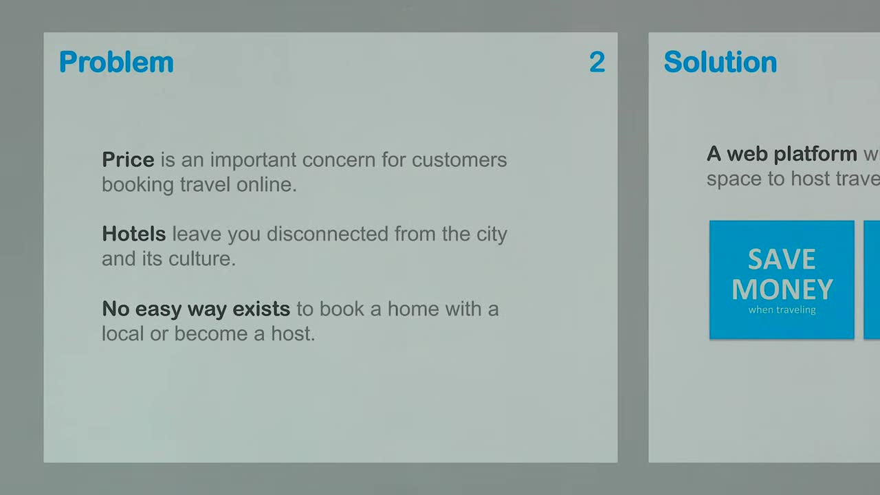
Slides 2-3: Problem → Solution = Mirrors
This is the single most important structural element in Airbnb's deck. The problem slide has three statements:
- "Hotels are expensive and impersonal"
- "Travelers want local experiences"
- "People have unused spaces"
The solution slide answers each one directly — like a mirror:
- "Rent out your extra space to travelers" (answers: unused spaces → rented out)
- "Stay with locals" (answers: travelers want local experiences)
- "Cheaper than a hotel" (answers: hotels are expensive)
As the Slidebean analyst notes: "Each statement basically answers one of the problems we posed in the previous slide — almost like they're mirrors of each other. We call that the 'problem-solution combination' and it's one of the hardest parts to nail."
Key insight: The problem statements are clear, specific, and undebatable. If your problem sounds like an opinion, the investor may not agree. Make it obvious.
Slide 4: Market Validation (Optional but Crucial)
Since "staying at a stranger's home" was a radical concept in 2009, Airbnb included a market validation slide showing that couchsurfing existed — proving people were already willing to do this. The analyst's take: "To a rich venture capitalist crashing on a couch might have been disgusting, but this is undebatable proof that something similar was already happening."
Slide 5: Market Size — TAM/SAM/SOM
Airbnb used a top-down approach estimating the number of trips. The analyst points out this was a weak point: "They assumed they'd capture 20% of their serviceable addressable market. 20% is arbitrary — a bottom-up approach using well-founded user numbers is much better." Ironically, Airbnb hit almost exactly the number they projected — 448 million trips in 2023 — but the 20% carve-out was unnecessary.
Slides 6-7: Product + Business Model
Product screenshots (likely animated during the live pitch) followed by: "We take a 10% commission on each transaction." That's it. Clear, simple, no complexity.
The analyst critiques that the business model slide runs projections without first showing average trip size or commission per trip — better to have shown: "Average booking X average commission = revenue per trip" first.
Slide 8: Market Adoption (Traction + GTM Merged)
This slide is genius because it merges two normally separate slides. On the left: partnerships they've built (traction). On the right: the Craigslist hack — every Airbnb listing was automatically cross-posted to Craigslist via a bot. This was their go-to-market strategy in action.
The analyst: "A go-to-market slide shouldn't be a list of marketing tactics. It should be this — just bragging about the stuff you're already doing that's going to carry you to the next milestone."
Slide 9: Competition
A standard competitive landscape chart showing Airbnb in the sweet spot.
What's Missing
No team slide, no ask slide, no traction numbers. This is because it was a public demo day deck — those slides existed in the full deck but were removed before publication.
The frame: Status Quo → Product → Market → "Why Us" Design grade: Poor (it is 2009)
2. Buffer — Radical Transparency (Seed, $450K, $5M Post-Money, Dec 2011)
Source: Relentless VC course — Venture Capital professor analyzing Buffer's actual deck slide by slide on screen.
Buffer's deck is famous for one reason: Joel Gascoigne published the entire thing with real revenue numbers. The VC analyst walks through it like a real investment committee — calculating MRR, ARPU, churn, and LTV from the slides.
Slide 1: Context — "Zuckerberg's Law"
The deck opens not with Buffer, but with the growth of social media. It quotes Zuckerberg's Law: people share more on social media every year. It establishes a macro trend before introducing the company.
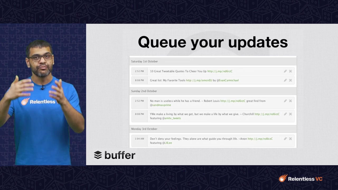
Slide 2: What Buffer Does
Queue your updates. A SaaS tool that plans and schedules social media posts. Simple one-sentence product description.
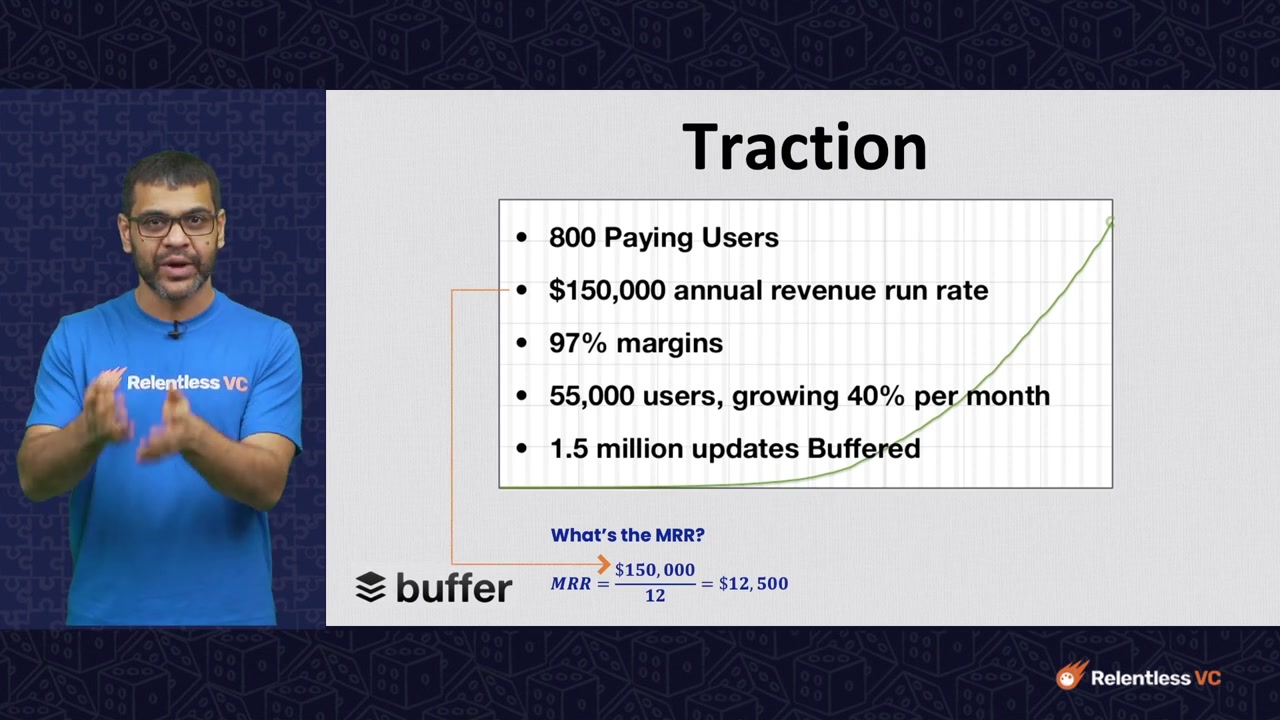
Slide 3: Traction — The Core Metrics
This is the money slide. Buffer shows:
- 800 paying users
- $150K ARR ($12.5K MRR)
- 97% gross margin
- 40% month-over-month user growth
- 55,000 total users (free + paid)
The VC analyst's internal calculation: "If this 40% MoM user growth sustains, Buffer grows 57x per year. If ARR grows at the same rate, it reaches $8.5M in one year."
At a $5M post-money valuation, the implied logic: "Invest $500K for 10% → 10% of $85M (10x ARR) = $8.5M = 17x return in one year." That's the math that gets VCs excited.
Slide 4: Milestones
Past milestones (achieved) in gray, future milestones (target) in green. Buffer aims for 1M users by Jan 2013 with $3.6M revenue — a more conservative projection than the 40% MoM extrapolation, which signals realism.
Slide 5: Business Model
Freemium SaaS. Free for basic, subscription for advanced. Buffer expects 2% of free users to convert to paid. 5% churn assumption.
The LTV calculation check: The analyst runs the numbers: at $15.6 ARPU and 97% margin, with 5% monthly churn, actual LTV should be ~$291, not the $240 Buffer claims. "They may have assumed 80% gross margin instead of 97%, or their churn is calculated differently." This level of analytical scrutiny is what real VCs do.
Key Takeaways from Buffer's Deck
- Lead with macro trends — the growth of social media was bigger than Buffer
- Show real revenue numbers — transparency creates trust
- Know your unit math — a VC will recalculate your LTV, ARPU, and churn to validate your numbers
- 40% MoM growth at seed stage can be more convincing than $150K ARR
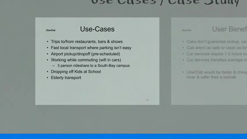
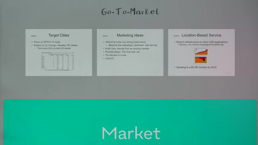
3. Uber — The Idea-Only Deck (Seed, 2008, Pre-iPhone)
Source: Slidebean — original deck shared by co-founder on Medium, analyzed slide by slide.
This is the most controversial deck on the list because there was no product. Uber raised its first money on an idea. The deck was 24 slides long and designed to be sent as an email (self-explanatory story, not live presentation).
Two Problem Slides
Uber had two problem slides. The analyst: "I love that this pain point is so obvious — we were all experiencing it. They just observed it and proposed the solution. Sometimes the best problems are hiding in plain sight."
Two Solution Slides
Both focus on the abstract concept without implementation details. The analyst would have compressed these: "Too many bullet points. Break into three columns, make it more visual, use the title as an extra bullet."
15 Slides In — Still in the "Product" Section
This is the deck's biggest weakness. Slide 7 and the investor still hasn't seen a product screenshot — because there wasn't one. "This was just an idea back then. Different times — in 2024 this would be a red flag unless you're a founder with exits under your belt."
Slide 10: Technology — Surge Pricing
This slide is the seed that became dynamic pricing. "Sadly for all of us, the idea for surge pricing probably derived from this slide."
Three TAM Slides
Too many. The first (taxi + limo service market) is the most crucial — painting the picture of a growing, fragmented market. The smartphone slide is valid because the entire product premise was GPS-enabled smartphones.
Best Case: $1 Billion. Actual: $37 Billion.
The potential outcomes slide forecasts $1B in annual revenue as a best case. Uber did $37B in gross bookings and $99B in revenue in 2023. The analyst's take: "If they'd put $37B on a slide, people would have called them crazy."
Go-to-Market: The Best Section
Clear roadmap of target cities with logic behind each choice. Realistic about marketing priorities. "The purpose of this round was mostly to build the product in a pre-iPhone world."
What's Missing
No team, no budget, no financials, no ask. These were almost certainly edited out for the public version — they existed in the real deck.
The lesson: Uber's deck succeeded because the problem was painfully obvious and the solution was well-articulated. But raising on an idea alone in 2026 requires a different caliber of founder credibility.
4. Front — The Metrics Deck (Series A, $10M)
Source: Slidebean — Mathilde Collin's actual Series A deck, shared publicly.
Front's deck is the opposite of Uber's. Uber had 13 slides about the product; Front has two. At Series A, as the analyst puts it: "Investors care less about the product and significantly more about traction. Seven out of 20 slides in this deck are about metrics — a whole third of the deck."
Slide 1: Problem — Two Sentences
"Email was built for individuals, not teams. Conversations get lost." Backed by data, reinforced by visuals. That's it. Two sentences. No bullet points.
Slide 2: Solution — Abstract
"A multi-channel email client." The product is described in terms of what it does, not how it works. The analyst notes: "Notice once again how the solution almost answers these questions and explains the product in the abstract."
Slides 5-11: The Metrics Block (7 Slides)
This is the heart of the deck:
- Traction: Brand-name customer logos (Shopify, Stripe)
- MRR Growth: 5.4x year-on-year growth in subscriptions — a beautiful hockey-stick chart
- Churn Rate: Below 5% — incredibly healthy
- Net Negative MRR Churn: Meaning existing customers increase their spend enough to offset churned customers, making growth inevitable even without new sales
- Cohort Table: Customer retention by signup month, proving stickiness is structural, not lucky
- GTM: Core channels described in few words, proving they understand their acquisition economics
The analyst: "Look at the beauty of that chart with 5.4x year-on-year growth. Churn below 5%. Net negative MRR churn. I almost have envy at this point."
Capital Efficiency + Projections
Solid, realistic projections showing not just revenue growth but team scaling. The analyst: "More than a solid deck — you're looking at a truly fundable Series A business."
The lesson: By Series A, metrics speak louder than product screenshots. Series A decks are metrics decks. If you're raising a Series A and your deck has more screenshots than charts, you're doing it wrong.
5. Dropbox — The Demo-As-Deck (YC S07, Seed, ~$1.2M)
Source: Dropbox's original YC demo video (3 minutes) and Matt C Smith's VC reaction analysis.
Dropbox didn't really use a traditional pitch deck for their seed round. Drew Houston's YC S07 application was a 3-minute demo video — a screencast showing file syncing across computers. It was so effective that it went viral within YC, and investors came to them.
What the Video Did
- Started with the problem: USB drives fail, emailing attachments is painful
- Showed the solution: a folder that syncs automatically
- Demonstrated the magic: drag file in → appears on all computers
- No slides. No bullet points. No market size slide.
Why It Worked
The video demonstrated a product that felt like magic. Investors didn't need to imagine what Dropbox would look like — they watched it work. Drew Houston had also built a working prototype, not just an idea.
The Lesson
If your product can be demonstrated, demonstrate it. A working prototype on screen is worth 20 slides of market analysis. Dropbox's video was so effective that YC uses it as a model for applicants to this day.
What These 5 Decks Teach Us Together
| Deck | Round | Slide Count | Best Slide | Biggest Weakness |
|---|---|---|---|---|
| Airbnb | Seed, $600K | ~10 | Problem-Solution Mirror | Arbitrary market assumptions |
| Buffer | Seed, $450K | ~12 | Traction (40% MoM) | LTV math slightly off |
| Uber | Seed, 2008 | ~24 | Go-to-Market Roadmap | Way too many slides |
| Front | Series A, $10M | 20 | Churn & Cohort Tables | Too much text on some slides |
| Dropbox | Seed, $1.2M | Video (0) | The demo itself | Hard to replicate without working product |
Three patterns every deck needs:
1. Problem-Solution Fit by Proof Whether it's Airbnb's mirror structure, Buffer's macro context, or Front's data-backed problem, every deck starts by making the investor feel the pain. If your problem slide doesn't resonate viscerally, nothing else matters.
2. Traction in the Right Format Buffer showed 40% MoM user growth. Front showed 5.4x YoY revenue. Airbnb showed the Craigslist hack working. Uber showed ... partnerships and patents (weakest of the five). The format changes by stage: seed = growth rate, Series A = revenue + retention metrics.
3. An Honest Ask Buffer's ask was clear: $450K at $5M post. Front's was clear: $10M Series A. Even Airbnb's public deck, which edited out the ask, was transparent about the round being a seed. Uber's public deck had no ask — likely edited out. Clarity about money inspires confidence.
We sourced these analyses from primary video recordings of the actual slides being shown on screen during expert breakdowns. Watch them yourself: Slidebean's "The Pitch Deck that Shaped All Pitch Decks" (Airbnb, Uber, Front breakdown on YouTube, 55K views), Relentless VC's "Analyzing Buffer's Pitch Deck like a VC" (18-minute VC course), and Matt C Smith's "VC Reacts to Dropbox Pitch Deck" (2.9K views).
Want to see how your deck stacks up against these five? Upload it to Bullpen for a free AI-powered evaluation across 7 investor categories.
Get weekly pitch tips
One email a week. Actionable advice for founders.
Upload your deck. Get scored in 2 minutes. Free. Try now →