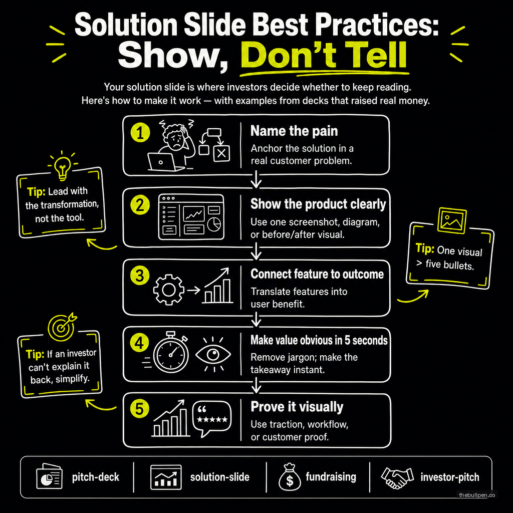
Solution Slide Best Practices: Show, Don't Tell
Your solution slide is where investors decide whether to keep reading. Here's how to make it work — with examples from decks that raised real money.
The problem slide makes the investor feel the pain. The solution slide shows them the relief. If either one fails, the deck fails.
The solution slide is where most founders over-index on features. They show product screenshots, list capabilities, and explain how the architecture works. They do this because they've spent months building the product and they're proud of it. But the investor doesn't care about your features. They care about whether your solution actually solves the problem you just spent a slide establishing.
A great solution slide does one thing: it makes the investor say "that makes sense." Not "that's impressive." Not "that's technically elegant." Just "that makes sense as the answer to the problem you described." Anything beyond that is a distraction.
Related: The Problem Slide: Why Most Founders Rush It (And Why You Shouldn't)
The Structure That Works
The most effective solution slides follow a structure that mirrors the problem slide. If your problem had three statements, your solution should have three answers — one for each.
Airbnb's 2009 seed deck is the template. The problem slide said hotels are expensive and impersonal, travelers want local experiences, and people have unused spaces. The solution slide answered each one directly: rent out your extra space, stay with locals, cheaper than a hotel. Every problem had a matching solution. Nothing was orphaned.
Front's Series A deck took a different approach. Their solution slide was two sentences: "Email was built for individuals, not teams. Conversations get lost." Then the solution: "A multi-channel email client for teams." That's it. Two lines. The analyst who reviewed the deck noted the elegance: they described the solution in terms of what it does, not how it works. Abstract, not technical.
Buffer's deck introduced the solution after a context slide about social media growth. Their solution slide was a single sentence: "Queue your updates." Simple. Descriptive. No architecture diagram, no feature list, no comparison table. Just the core function stated clearly enough that anyone could understand it in five seconds.
The pattern across all three: the solution is simple, direct, and clearly connected to the problem. None of these decks tried to explain how the product works. They explained what it does and why it matters.
Screenshots: When They Help and When They Don't
Product screenshots can make a solution slide or break it. A well-chosen screenshot that shows the core value proposition in action is worth a thousand words. A cluttered screenshot that requires explanation is worse than no screenshot at all.
DocSend's pitch deck study found that investors spend an average of 2.4 minutes on the combined problem and solution slides. That's not a lot of time for a screenshot to do its work. The image needs to communicate its point in under two seconds.
The screenshots that work: a single dashboard that shows the key insight at a glance. A before-and-after comparison. A simple workflow diagram that shows how the product fits into the user's existing process.
The screenshots that fail: a full-page UI with 15 data points and no clear focal point. A login screen. A settings page. Anything that requires the investor to read text inside the image.
If you're going to include a screenshot, crop it tightly. Show only the relevant part of the interface. Add a callout or annotation if needed to guide the eye. A screenshot should explain itself within the visual hierarchy of the slide.
What to Leave Out
The solution slide is not the place for your product roadmap, your technical architecture, or your feature comparison against competitors. Those all belong later in the deck or in the appendix.
The solution slide is also not the place for your pricing. Pricing is its own conversation and should come later, usually after the investor has bought into the product vision. Putting pricing on the solution slide signals that you're more focused on transactions than on solving problems.
And the solution slide is not the place for your team. The team slide comes later. The solution slide should be about the product and nothing else.
The Test
Read your solution slide to someone who knows nothing about your space. If they can explain back to you what your product does and why it matters after hearing only the solution slide, it works. If they need to see the problem slide again to connect the dots, the solution slide isn't doing its job.
A more advanced test: read someone the problem slide, wait 10 seconds, then read them the solution slide. If they spontaneously say "oh, that makes sense" — before you ask them anything — you've nailed it. If they look confused, you have more work to do.
The best solution slides disappear into the narrative. They feel inevitable. The investor should finish reading them and think "of course that's the answer" — not "I need to think about whether that makes sense."
Data references: DocSend 2018 Pitch Deck Study (time spent per slide), Airbnb YC W09 seed deck analysis (Slidebean), Front Series A deck (Mathilde Collin, published analysis), Buffer seed deck (Joel Gascoigne, Relentless VC analysis).
Ready to see how your solution slide stacks up? Upload your deck to Bullpen for a free AI-powered assessment across 7 investor categories — including problem clarity, solution fit, and competitive positioning.
Get weekly pitch tips
One email a week. Actionable advice for founders.
Upload your deck. Get scored in 2 minutes. Free. Try now →